Art of the Title
Title Sequence #1 - The Conjuring
1. Which credits do we see and the order we see them in?
- Introduction of a family (The Perron Family)
- Introduction of another family (The Warren Family)
- The director
- Written by (two people)
- Produced by (three people)
- Executive Producer (two people)
- Director of photography
- Production designer
- Edited by
- Actor
- Actor
- Actor
- Actor
- Actor x4
- Actor x3
- Casting by
- Costume Designer
- Music by
- A New Line Cinema Presentation
- A Safran Company/Evergreen Media Group Production
- A James Wan Film
- The Film Title - The Conjuring
Total of 28 credits.
2. What font type is used for the titles?
The font type is typed in sometimes White and sometimes Black, depending on the backdrop.
3. How do we see the font - where do we see it in the frame?
The font is presented over Moving Images and due to the in-identical back drop in every image, when the font is black it is conveyed in front of a white background the show high contrast, if the background image is dark then there is a white box placed where the writing is to create the contrast and vice versa when the text is white.
4.What happens behind the font - what do we see, who are we introduced to, what sound do we hear?
During the title sequence we are introduced to history of the film, as it proceeds in order, with old images of family photos and the names of the leading actors and actresses who will portray these supposedly real people. Along with the moving images sound is played creating a chilling mood.
5. What do you like about this sequence, why did you pick it?
I chose this title sequence because they have used Titles over Moving Images, which is more complex than Titles on a blank screen or Titles on still images and have managed to really create the tone of the film as well as giving background to the film for their audience without giving too much away and leaving the audience with an aura of suspense.
Title Sequence #2 - The Incredibles
1. Which credits do we see and the order we see them in?
- Title
- Written and directed by
- Produced by
- Executive producer
- Associate producer
- Music by
- Story supervisor
- Film editor
- Supervising tech director
- Production designer
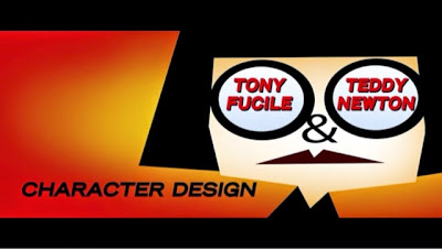
- Character designer x2
- Supervising animators x3
- Directors of photography x3
- Art director
- Shading supervisor
- Hair and Cloth simulation supervisor
- Sets sequence supervisor
- Effects supervisor
- Rendering supervisor
- Production manager
- Sound designer
- Casting by x3
- Additional casting by
- Cast (in order of appearance)
- Actor (multiple list of names)
Total of 31+ credits.
2. What font type is used for the titles?
The font type is plain and readable and the font colour consistently changes depending on the background of blank screen or moving motion but the colours used are black, white or red. Bold colours which stand out against the colourful array in the background which appeals to their child audience.
3. How do we see the font - where do we see it in the frame?
The font is incorporated in the moving anomation or motion that is presented amongst it. It is mainly centred but moves along with animation behind it.
Behind the font we are introduced to the characters and the story line of the film as throughout the title sequence a small summary of the events in the film are played out for us, for example when we see Dash running through across water as he tries to escape "bad guys". We hear a continual escalating thriller sound along with the title sequence which builds an interest in the thought that there is going to be some sort of drama in the film.
5. What do you like about this sequence, why did you pick it?
I chose this title sequence to analyse because they have used Titles using Animation or Motion, requiring exceptionally more advanced skills through the key use of technology as appose to Titles of a Blank Screen, which would require not much effort. Through their work they have conveyed a thrilling atmosphere to their audience, the right atmosphere and due to this they will have excited their audience for what lies ahead.


No comments:
Post a Comment